Let’s start with hyphenation today.
USE HYPHENATION: DON’T AVOID IT
I see a lot of small press books where they try to solve the problem of a word processor’s hyphenation mistakes by just turning off hyphenation completely. Please do not do this. Remember you have justified the text on your Body Text Pages (right?). Allowing no hyphenation forces the software to make too much space between some words and can lead to what’s known as the River of White. The River of White is BAD. It’s like you can see white cracks in the page there’s so much space between the words. The River of White is not only kind of ugly, it disturbs readability. (I read recently a blog post from a dyslexic woman who said rivers on the page make it impossible for her to even read a page. Her eye keeps getting drawn away from the words.)
ELIMINATE EXTRA SPACES
Speaking of the River of White, avoiding it is also why you should never put two spaces after a period. Chances are you or your authors are in the habit of typing two blank spaces after a period. (If you are, please stop doing it if you can. Just think about all the time you’ll save not typing that extra character a few thousand times in every manuscript.) Before you start typesetting a manuscript, strip out ALL those extra spaces. Just ONE space after a period or other punctuation. And never, ever use a tab to indent a paragraph, or worse, five blank spaces in a row. NEVER. Even in MS Word. Use the paragraph format settings to give yourself a first line indent of about a quarter inch, no more.
INDENTS SHOULD BE SMALL
That’s worth repeating. The default first line indent in Word is a HALF INCH. That’s HUMONGOUS. On an 8.5×11 inch manuscript page, which is double-spaced and all, a half inch doesn’t look like much. But on a regular book size page, which is HALF the size of the manuscript page? At 5.5″ x 8.6″ or 6×9″, that half inch on a book page is huge. More importantly, it’s LARGER than a small word. That’s too big. I use .25″ or even .23″ for most of my jobs. Open a professionally typeset book from Random House or Penguin or HarperCollins and measure the indent. I just did on the one on my desk and it’s a mere point-one-eight inch (.18″).
The indent should be smaller than a small word like “her” or “fit.”
BACK TO HYPHENATION…
Okay. So you’ve set up your Body Text Page to allow hyphenation. In both Quark and InDesign there are settings where you can tell it “don’t hyphenate three or more lines in a row”. Once upon a time (like 15 years ago) you could also tell software not to hyphenate Proper Nouns and not to hyphenate the Last Word of a Paragraph. Somewhere along the way we LOST these capabilities. (Maybe they were never in Quark or Adobe products and were only in the late, lamented Ready,Set,Go!) Instead, nowadays, you must input the proper names of your characters into the Hyphenation Exceptions menu. Yes, I’m serious. If you have a character named Daniel, you never want to see a line end with “Dan-” and the next one start with “iel”.
While you’re adding things to hyphenation exceptions, add all the contractions: don’t, won’t, isn’t, ain’t, didn’t, wouldn’t, couldn’t, shouldn’t, aren’t, weren’t, can’t, doesn’t, hasn’t, hadn’t, could’ve, would’ve, should’ve, you’ll, she’ll, he’ll, et cetera. I have no clue why these aren’t standard in the built-in exceptions. If you’re using Quark there is a way you can set them to apply to all future documents, though. (Set them with no document open. If you have a document open it will only apply the exception to that one.)
You also never want to see a paragraph end with a hyphenated word. Like if the last word of the paragraph is “locomotion,” you don’t want to see the second to last line end with “locomo-” and then just “tion.” on a line but itself. But you don’t want to make that word a hyphenation exception, as you do want it hyphenated in most other cases. You have to go through and fix them BY HAND.
- DO NOT HYPHENATE:
- proper nouns
- contractions
- last word of a paragraph
- more than two lines in a row
A typesetter I was talking to recently said that it’s normal to have to touch EVERY PAGE in a book at least once. Yes, in a 250 page book, you can expect an average of 250 adjustments to be made by hand. (And that’s if the manuscript was nice and clean to start with.) You’ll find a bad hyphen or something needing adjustment on almost every page. Perhaps a widow or an orphan.
WIDOWS AND ORPHANS
Most likely if you’ve talked typesetting, you’ve heard the terms widows and orphans. If you haven’t, you really need to know this.
Let me begin by saying that a lot of the rules of typesetting are being ignored wildly by the big publishers in some books. I’ve been seeing things like bad hyphenations (like hyphenating across a page break — ugh!) in mass market paperbacks for years and years. But you almost NEVER see actual widows or orphans, although there are exceptions.
I know someone will ask: what’s the difference between a widow and an orphan? Both describe a situation where some text looks abandoned (orphaned or widowed) on the page. If you try looking up which are which, though, you’ll find some contradictory definitions. The basic point is this:
- You don’t want a single short word on a line by itself at the end of a paragraph. This one gets ignored a lot, though, in pro type jobs, so maybe it’s a partly the designer’s taste (or hourly fee) that determines it.
- You DEFINITELY don’t want just a portion of a word after a hyphenation on a line by itself.
- Even worse, you don’t want a single word, portion of a word, or a line shorter than a full line at the top of a page, “widowed” from the rest of the paragraph it’s supposed to be married to.
- When using a two column format, you also don’t want just the first line of a paragraph by itself at the very bottom of the left column, although they say it’s generally acceptable to have a full first line at the bottom of a regular page. That one’s probably at your discretion, then.
Here are some examples from two small press books sitting on my desk. I’ve made them kind of blurry to obscure their identities (I hope) since my intent is not to make fun of specific publishers. These are very good books! They’re just typeset by folks who didn’t seem to know better.
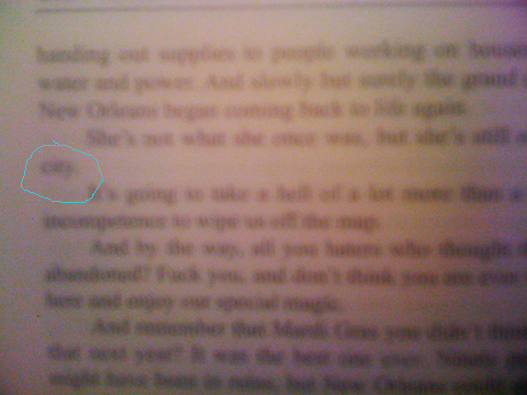
Here’s an orphan that also shows how huge the indent is. On this book the indent is half an inch. That’s the word “city” circled there and completely surrounded by whitespace because of the combination problem of too large an indent and also being orphaned on a line by itself. You know how there are rivers? There are “lakes” and “puddles” too, which you should avoid.
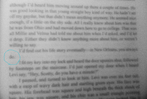
Here’s one with an even worse “lake” around it!
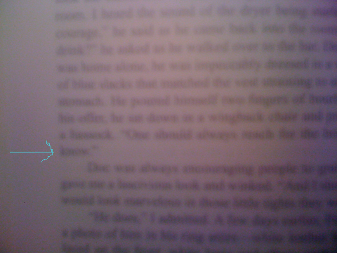
Here’s one at the end of a block paragraph. That little word “know” shouldn’t be allowed to be on a line by itself, as far as I’m concerned. Some typesetters would let this stand, though, so this one’s at your discretion. However with a nice big block of text like that, it could easily be adjusted not to be like that.
But wait, I hear you asking: how do I fix it? There are a couple of possible ways, some better than others.
FIXING ORPHANS & WIDOWS
If you’re the author, you might consider rewriting a word or a line, or breaking up a big paragraph into two, but that way can lie madness…! You’re supposed to be designing now, not endlessly rewriting your text. And if you’re not the author yourself, the author almost certainly does not want a typesetter messing with the prose!
Generally speaking, you want to either get that lone word to go back up with its brothers in the block of the paragraph, or you want some siblings to come down and keep it company so it’s no longer orphaned. My preferred fix in this situation is to adjust the Tracking. Say I’ve typeset this in Joanna 11.5 point type, or Garamond 12 point, or even Palatino 11 point. The human eye will not be able to discern a Tracking adjustment of up to +3 or down to -3, and sometimes you might be able to go all the way to +5 or -5.
Start with +1. Did that make everything in the paragraph reflow to send another word or two down with the orphan? No? Then try -1. Did he go up with his sibs? No? Then try +2. Then -2. Then +3. Then -3. If none of those 6 attempts fixed it, then I might try adjusting the actual wording.
It can get even worse, though. You can end up with the dangling text all by itself on the top of the next page! Viz:
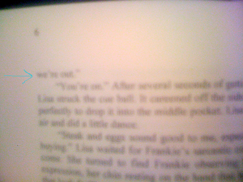
In this case, anything that is less than a full line needs to either go back to the previous page or a whole line needs to come join it on the next page. Here’s another:
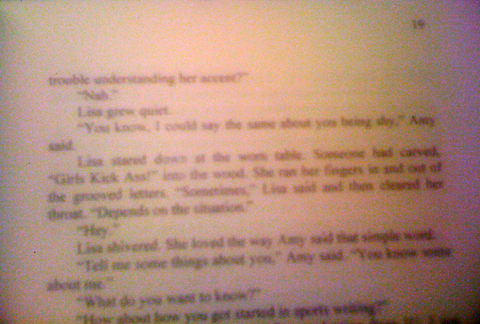
FACING PAGES SHOULD BE SYMMETRICAL (AND SO SHOULD BACK TO BACK)
Here’s the thing. You can’t just stick a carriage return in at the bottom and create a bunch of blank lines at the bottom of one page and start the paragraph at the top of the next, because then you’ve screwed up the symmetry of your text blocks. Now you’ll have a white gap people will see the shadow through the page, and you’ll have a verso-and-recto pair that aren’t the same size.
Use the same technique, only look for a paragraph that precedes it, perhaps by several pages, that looks like a good candidate for a -1, -2, or -3 tracking adjustment, which will result in the paragraph being shortened by a whole line. You might even have a spot where you “fixed” one orphan by making a word go down and join it, but now you need it to go the other way.
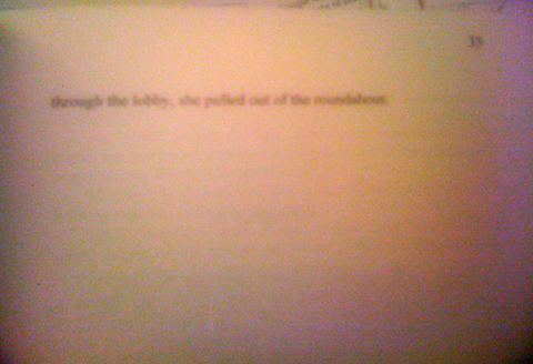
And needless to say, having a widowed line that is completely alone like the above is really, really bad.
Other techniques for fixing them, when Tracking adjustment fails? If the orphan is caused by the last word being hyphenated, insert the non-hyphenation character before the word and only that one incidence of the word will be unhyphenated. Sometimes the entire paragraph will adjust to suck up the fragment.
Sometimes you just can’t seem to get it resolved, though — every time you fix one, you create another. A three line paragraph that crosses a page is often a problem. One cheat I’ve done sometimes is to shorten or lengthen the text block on the chapter opening page by a single line, either at the top or the bottom of the block. Since that page won’t be a mirror image of the one facing it, it’s possible to make an adjustment there that won’t be noticed except perhaps by the shadow coming through the page just where the line was removed. But sometimes you have to make a judgement call of what’s worse. Not every puzzle has a good solution.
Next post: what’s not so smart about “smart” quotes, section breaks, and fleurs. (Click here to continue.)

1 Comment