DIGITAL BOOKS VERSUS PRINT BOOKS
All the previous posts in this series have been about producing printed books, especially trade paperbacks.
But now let’s talk about ebooks. Some people say you don’t have to “design” for ebooks. Well, some people are wrong…?
Right now the most popular format for download is still the PDF. This boggles my mind, given that I would think other formats would be much more usable on digital reading devices. But a lot of people either still prefer something that really looks like a book and not like a Word document. Many who are reading on iPads can even make a two-page spread which looks book-like.
Then there are folks who are printing the dang things out to read. I was actually shocked to find people purchase PDFs from Circlet.com and then print them out. I thought it would make so much more sense for those people to just… um… BUY A PRINTED BOOK?? But if the people want PDFs, then PDFs they shall have.
When designing a PDF to sell as a download, if I’m doing a print edition, I will usually try to use the same file as my basis, so it follows all the regular print design rules, but I may make the following adjustments for the digital only version, depending on the design:
-Technically we no longer need the thumb margin, but it’s nice to keep SOME margin just to make it easy on the eye which is used to seeing a strip of white. I might reduce the size of the margin some, though.
-Undo the facing pages. I usually keep the verso and recto headers, but I will undo the gutter margin and center the pages.
-Get rid of the blank pages, don’t always start New Right. Note that if you do this, you will need to adjust page numbers in the table of contents.
-Insert live links. Using Adobe Acrobat you can make that URL to the author’s blog mentioned in their bio an actual link. I try not to go crazy with this, though. You want people to enjoy reading the book, not have a stray click accidentally bring them to some web page instead.
Typically the other big adjustment to make is with the cover. Here are the guidelines I give to artists who want to submit cover art to Circlet Press:
“Art needs to look good when small (100×150 pixels, 72 dpi) and also large (600 x 900 pixels, 72 dpi). For this reason, bold simple images tend to work better than scenes with a lot of detail in them.”
Lots of the sites where the book may be sold will be displaying only a postage-stamp size thumbnail of the cover. So you want it to look good when teeny. However, it has to still look good when the customer clicks on it and blows it up to actual size.
For this reason bold colors or contrasts are also recommended. And the type, as mentioned in the previous post, needs to be BIG. If you thought it had to be big before, it’s even more important now.
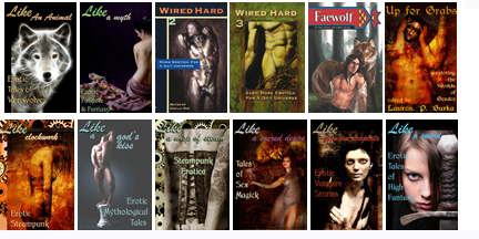
I’m not the world’s greatest designer, and many of the covers shown below were created using stock photography from istockphoto or dreamstime, where the selection of fitting images is sometimes limited. But here’s a sample of the thumbnail sizes:

And I think that’s it. There are probably some secrets out there on how to “design” better for the Kindle or ePub files, but when the user can change the font to what they like or adjust the size with a click, a lot of regular design goes out the window anyway. Someone else will have to take up that topic. Or maybe I’ll start another series later after I’ve played around with those things more. Also if folks have questions that were not answered by the preceding, comment with them! Chances are other folks have the same question(s). I’ll either answer in comments or it’ll spawn more posts…
Here’s the recap though:
1. Farming Out to Professionals
2. Elements of Book Design
3. Page Layouts
4. Widows, orphans, and hyphenation
5. “Smart” quotes, section breaks, and fleurs
6. Ebook design versus print design

I suspect that PDFs are popular because there’s less fear of the format becoming unsupported than with ebook specific formats.
And they’re so easily portable from device to device, as well. A very safe choice. (Unless they have the kind of DRM that is on some of the ones I have on much older ebooks — I’ve lost the passwords, the place I bought them from doesn’t exist anymore, and even my hacker friends can’t crack them. So they’re worthless now.)
My sense is, if you’re going to do only one ebook format, do PDF. It won’t look great on anything, but it will work on everything. Conversion scripts between epub and Mobi and the thousand lesser formats are frought with peril.