Cover design poll!
So, I’m going to do an ebook edition of my old collection of erotic short stories that Harper Collins published back in the 90s, BLACK FEATHERS.
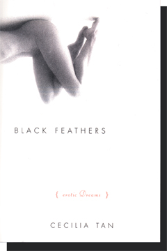
The original cover featured a gorgeous naked woman, upside down, and was almost entirely black and white except for the small, tasteful lettering of the subtitle “{erotic dreams}”. I really loved this cover. Also, she wrapped around from the front cover onto the back, which of course won’t work for ebook, where there is no back or spine.
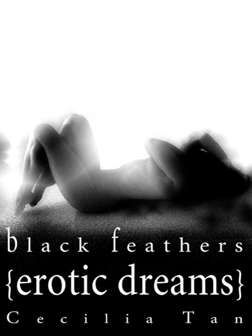
When Harper did an ebook edition of the book, before they let the print edition go kaput and I got smart and took the rights back, they used the same image, but much larger, put her all on the front, and kept it monochrome.
So what I’d like is to do something in the new ebook edition that might echo the old cover, but might take a few things into account. Among other things… why does it have to be a woman on the cover when men are just as much the erotic focus in the book as women are? The days when a man on a cover automatically meant “gay” are over, and I agree with the arguments of Erotica Cover Watch who say that if women write erotic material about men for a female audience then a naked chick on the cover can be just plain wrong.
However, my work is nowhere near that easy to categorize, many of the stories have queer and bisexual themes, there are both female and male narrators, etc.
In other words, there’s no clear thematic or political reason to choose either a male or female image. I lean toward male just to avoid the “male gaze” connotation those images often carry, but only somewhat. I like women, too, and women are both the narrators AND the erotic focus/object of many of the stories. But then there are gay male stories, too. Yeah, I’m confusing like that.
So I did two versions. One with a male figure, one with a female figure. And then I did two versions of each of those, one with naturally bright color (red) and one with desaturated color.
So, have a look and give me your thoughts. Images below the cut:
The original HarperCollins cover:

(and no, the original art is not available as far as I know, and I probably couldn’t afford it if it was… and no, it’s not a photo of me. I used to joke that it was Elizabeth Wurtzel, which if you were in publishing in the late 90s you’ll appreciate.)
And here’s how they revamped it for ebook purposes, originally, below:

And now here are my four experiments for new cover:
Version 1a — male desaturated, below

Version 1b — male saturated, below

Version 2a — female desaturated, below

(ignore streakiness in her skin tone — I was erasing the watermark from the comp version of the image)
Version 2b — female saturated, below

(ignore streakiness in her skin tone — I was erasing the watermark from the comp version of the image)

The first or the second image would be great. I think the red feather in the third and fourth images is moderately confusing, given the title. And the body art on the first model adds something, I think, that the second model lacks. It’s much more visually interesting.
(There is also something to be said for using a male-identified body on the cover. I sometimes feel like erotica by women ends up published with women on the cover, no matter the content. I feel like the first two images suggest a wider audience for the book–the model is dreaming along with you, as are the readers.)
I tried to photoshop the red feather to black, actually, but it just didn’t look good. Also making the image b/w and then re-colorizing her lips, but it just didn’t look right either. I might try to get someone with better photoshop skills than mine to try again, but I am leaning more toward the male figure for just the reasons you describe.