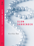
 So my search continues to try to find an erotic BDSM romance that used a pearl necklace on the cover before Slow Surrender, but it’s looking more and more like the designer at Hachette might have been a very early adopter of female accoutrements/jewelry to “the look.” (See my previous picspam post of trends in erotic romance covers ever since 50 Shades of Grey. Who knew that book title was going to literally describe the monotone and desaturated look that would come to dominate? Heh heh, I said “dominate.”)
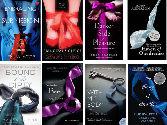
I mentioned in the previous post there were SO MANY books with a red ribbon. That’s expanded to blue and purple now, too:
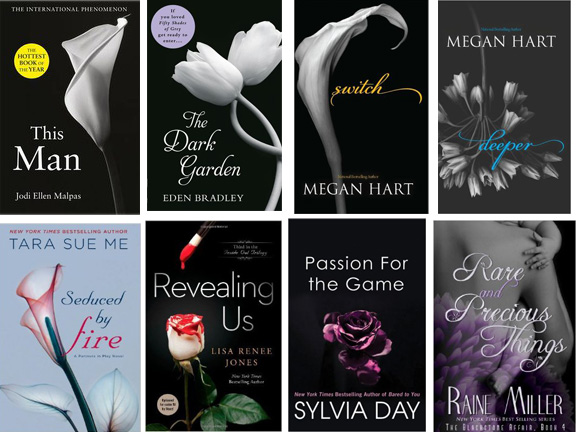
And I mentioned lots of covers have flowers on them as the single object of focus. Here’s a compilation of recent flower covers:
One point I feel I should make. I am not in any way complaining that these books look so similar. I think it’s rather brilliant, actually, that without any actual discussion taking place from one publisher’s art department to another, a consensus has emerged around what this genre “looks like.” Of course, now it perhaps is getting overdone, which is why it is evolving in various directions, yet still maintaining various signifiers. In the previous post I talked about the leap into jewelry and below I’ll get into some other trends that are appearing.
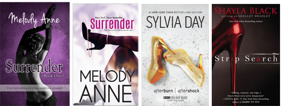
Someone did point me at one indie/self-pub book entitled Surrender that has both the commonly seen high-heeled shoe and a pearl necklace! But the pub date is March 29, 2013, two full months after Slow Surrender had its release, and I also note that it had two versions of the cover, one that was more in the style of the dark-with-one-color vein and one that was more “contemporary” romance looking.
And for fun here are two MORE covers with high heels on them:
One author whose covers consistently have been going AGAINST the trend, I think very intelligently so, is Maya Banks. Her publisher went the opposite way for her “Breathless” trilogy, using WHITE instead of black/gray/desaturated-blue:

And now they’re going all out with super-saturated colors for her latest series, but I note the series is called what? The “Surrender” trilogy. And the images are what? Flowers. So they’re staying firmly within the genre conventions and milieu, and yet giving them a really vibrant look:
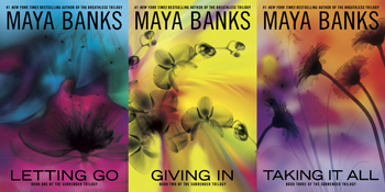
I haven’t read these yet, myself, but my impression from reading reviews is that the insides are as vibrant as the covers! Fitting.

Hi Cecilia,
I think my Vina Jackson covers appear to have bucked the trend! See them on amazon.co.uk (the US ones are not quite as good…)
Hm, am I seeing the right ones? If so, they are right on trend (as described in the previous post), with monochrome covers with a single element of color. Very identifiable in the BDSM book genre. In fact, I used 80 Days Yellow in the previous post.


What’s really cool is that your German publisher is also right on trend for the German market! We talked above about how the Maya Banks books in the US are going for really bright-colored flower close-ups, right? Well, that’s what 50 Shades looks like in Germany (though note they put tiny insets of the original covers ON the covers, in case people were confused…!). Your publisher there went right for “the look” for that market. Very smart merchandising.