So, if you’ve been following any of my posts over the past year about my recent romance series from Grand Central Publishing, you’ve seen the covers feature a “pearl necklace” theme (hur hur, it’s okay, you can laugh about the double meaning…). Today I’m going to explore a little bit of the world of cover design in mass market romance publishing. I love my covers–I think they’re sensual and beautiful, but there’s so much more going on here for the publisher than merely making something beautiful. There are some trends happening, and I’ll explore them below with copious graphics.
One thing I should add, in case you don’t know it: authors at any medium to large publisher rarely get any say in what their book covers will look like. Sometimes we don’t even get a say in what the title of the book is. The publisher buys the rights to your manuscript, which means they bought the right to package and market the material any way they think will make them the most money.
My publisher is a division of Hachette, which is one of the “Big Six” publishers (soon to be Big Five, since two of them are merging), and until fairly recently you might have recognized their name better when they were Warner Books, or Time Warner, or any number of other incarnations. Publishing is like that. The point is, they’re one of the major trade publishers in the English language, and they’re much more about “merchandizing” than a smaller company might be. This is not necessarily bad–it means they’re doing everything possible to maximize the reach to mass consumers. For something as commercially “hot” right now as BDSM romance, which my books are, they’re the perfect publisher to get the books out to a large audience. They’re definitely the only publisher I’ve ever been with who got my book stacked up in Target, for example.
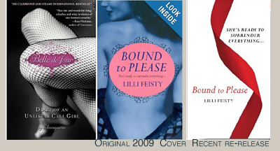
I first got a glimpse of the packaging they chose for Slow Surrender, the first book in the series, all the way back in summer 2012, when the 50 Shades of Grey phenomenon was still on the upswing, and the establishment of the “look” of the copycat books that came after it was well underway. Note: 50 Shades did not “invent” that look–Blue Moon Books, a venerable smutty book publisher that went out of business some years ago, often featured desaturated colors or black-and-white photos as a way of giving the “hint” of the flavor of the books. But you didn’t see those covers on erotic ROMANCE novels really until after 50 Shades really broke “the look” into the mainstream. (Two mainstream precursors to “the look” that I found were, interestingly enough, both published by my publisher Hachette/GCP: Lilli Feisty’s books like Bound To Please, originally released in 2009, and the Belle de Jour memoir from 2007, Diary of an Unlikely Call Girl. I *think* the original releases had that black and white with one bit of color “look” to them. Please update me if I’m wrong on this:)
But in the summer of 2012, as the 50 Shades copycat wave was beginning to hit full stride, if you walked into any airport bookstore (as I did, many times) you were likely to see a front-facing shelf with all three 50 Shades books at the top, and the rest of the shelf filled with 15-20 more titles sporting very similar visuals: black and white or “sepia-tone,” perhaps with one element of color, and featuring a single object as the focus. The iconic cover of 50 Shades had the gray, knotted tie. The series that picked up close on its heels was Sylvia Day’s “Crossfire” series. The first book in the series, Bared to You, took the same motif only instead of a tie it was a man’s cufflinks. (In fact, found a blog post showing that Bared to You first had a nude woman on the cover, then a high heeled shoe, THEN the 50-shades-ish cufflinks, see HERE.) Some books kept with the “billionaire’s accoutrements” theme, others used BDSM toys, or other suggestive images like flowers, feathers, or scarves.

Bared to You, Sylvia Day, released April 2012
Reflected in You, Sylvia Day, released October 2012
The Siren, Tiffany Reisz, (original cover before the Harlequin Mira edition)
Publishers were clearly targeting the customer they hoped was looking for something to read next after 50 Shades and were using the similarities in cover design as a tipoff, a visual signal as to what might be inside. Some of the ones I saw everywhere I went that summer and into the fall of 2012:
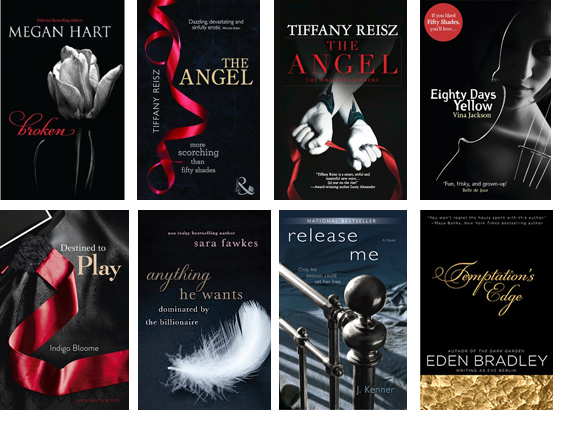
Broken, Megan Hart (September 11, 2012, Harlequin MIRA)
The Angel, Tiffany Reisz, released September 25, 2012 in the US, October 1 in the UK
Eighty Days Yellow, Vina Jackson (September 25, 2012, Open Road Media)
Destined to Play, Indigo Bloome (September 11, 2012, HarperCollins)
Temptation’s Edge, Eden Bradley (October 24, 2012, Penguin USA)
Anything He Wants: Dominated by the Billionaire, Sara Fawkes (November 27, 2012, St. Martin’s Press)
Release Me, J. Kenner, January 1, 2013
There were a lot more with the “red ribbon” or single ribbon in another color, too. Red ribbons are some kind of kinky signifier, I guess?
Many of the above covers also had a banner or sticker or words printed on them that flat out said “If you enjoyed 50 Shades, you’ll love this!” But they clearly were counting on the visual cue to catch the eye of the reader and draw them in. These books all had the advantage over the usual “man titty” romance cover and the usual “female titty” erotica book cover that they weren’t quite so glaringly obviously geared to the prurient interest. Okay, it’s obvious to us, because we’re analyzing the trend. But they were less glaring, supposedly, to the general public. They were considered “tasteful” looking.
Various self-pub and hybrid authors also went for this “look” in their self-pub books. Two examples of the many in the Kindle store:

The Sacrifice, Evangeline Anderson, August 30, 2012
Training Tessa, Lyla Sinclair, June 7, 2012
Even nonfiction books on BDSM got the treatment. Melissa Febos’s memoir was published in 2010 and was re-released with a new cover that fit the trend:

Whip Smart, Melissa Febos (St. Martin’s Press, 2010 and then 2011 edition)
And even another book that has the title Whip Smart, a historical by Kit Brennan based on the real-life adventures of Lola Montez, tried to cash in on the trend (even though I think it may have missed its actual audience as a result…?) “A wild and sexy romp through history based on the real-life adventures of the audacious, Lola Montez.It is 1842, London, and the gorgeous, ever-capricious twenty-two year old Eliza Gilbert, (aka Lola Montez) is in deep trouble and seeks escape from a divorce trial. Will Lola’s reckless daring, feminine whiles, and signature whip be enough to save her life and preserve her cause?”

Whip Smart, Kit Brennan (January 1, 2013, Astor + Blue Editions)
There are more, LOTS MORE, but I’d like to move on to the trend that came next, and the one my books are a part of.
I first saw the cover design that Hachette/GCP had cooked up for my book SLOW SURRENDER on September 5, 2012, after we’d been discussing ideas all summer. In June, my editor had written about the cover design discussions they were having internally at the publisher, and the idea that they “would like to keep these books very simple, using one graphic for each cover” in keeping with the trend that was going on. But instead of using a single object like a BDSM sex toy (The Prince had used a riding crop, 50 Shades Freed had used handcuffs), we tossed around the idea of using a glass marble (there’s significant use of a marble as a sex toy in book one), a paint brush (book 2 has a lot of art talk in it), and also the idea of a glass heart. But in the end, the cover designer went for the sensuous and suggestive pearl necklace.
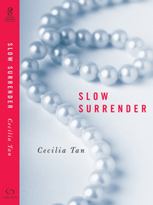
I loved this immediately because with its blue-gray color and focus on the twist, to me it was so very clearly a reaction to the iconic 50 Shades. And that’s what my book is: a reaction. I knew the book would be read by many people who had read 50 Shades first, and it would inevitably be compared. I also knew that one of my goals in the book was to present a female “submissive” character who was more like the submissive women I know (and that I am), which is to say: empowered, outspoken, active, and powerful. So I liked how the pearl necklace (besides being a kind of visual evocation of the sex slang term) was a direct analog to the tie on the cover of 50 Shades, but making a statement that this book is the female empowerment version.
The Slow Surrender cover was quickly circulated. I posted it on my own blog right away and it had appeared on Amazon and the other sites by early October. Slow Surrender was released in ebook in January 2013, over a year ago.
What I noticed immediately upon the ebook’s release, of course, is that all of a sudden many other book covers with pearls on them began to appear. In fact, many of them would appear in the “Customers Who Bought This Item Also Bought…” bar on Amazon.
Some were also from my publisher. Viz:

All He Wants, CC Gibbs (July 9, 2013)
Others were from other publishers.
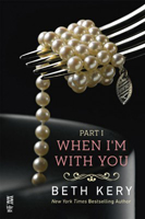
When I’m With You, Beth Kery (September 2, 2013, Penguin USA)
And then I started to see other female jewelry appearing, diamonds, charms, etc. A whole new milieu in cover design was launched.

No Reservations, Stephanie Julian (September 3, 2013, Penguin USA)
S.E.C.R.E.T. by L. Marie Adeline (February 2, 2013, Crown Publishing Group)
The Submissive, Tara Sue Me (June 2, 2013)
A Million Dirty Secrets, CL Parker (August 27, 2013, Random House)
Addicted to You, Beth Kery (April 2013, Headline UK, Hachette Australia)
I’ve even seen the exact same photo of the necklace that was used on my cover, now being used on another book that is launching today, in fact!
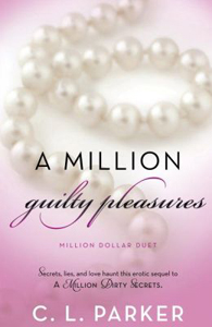
A Million Guilty Pleasures by C.L. Parker, (February 4, 2014, Random House)
The billionaires are still showing up with their stuff, too, of course. Here’s the wristwatch, a walking stick, another tie, etc…
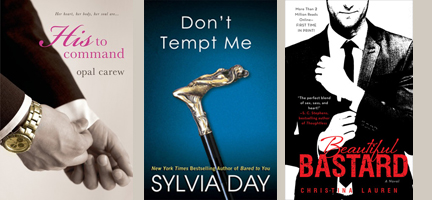
His to Command, Opal Carew (April 16, 2013, St. Martin’s Press)
Beautiful Bastard, Christina Lauren (February 12, 2013, Gallery Books)
Don’t Tempt Me, Sylvia Day (January 2013 reissue with cover makeover to match trend)
And wow so many high heeled shoooooes:
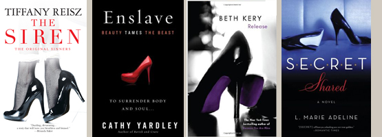
The Siren, Tiffany Reisz (June 1, 2012, Harlequin MIRA)
Enslave: Beauty Tames the Beast, Cathy Yardley (April 23, 2013, HarperCollins)
Release, Beth Kery (October 2013, Headline)
Secret Shared, L. Marie Adeline (October 15, 2013, Random House)
You get the idea. “The look” is a thing and there are variations on it, masculine and feminine. I could have done another set of covers that all have single flowers, especially calla lilies, but also roses, as their signifiers. (Update: I did another post with flower covers and MORE ribbons, here: https://www.ceciliatan.com/?p=1713)
I decided to try to dig back and see if I could figure out which book was the first to have a pearl necklace? Or female jewelry? In the end I turned up a lot more covers that fit the trend, but I couldn’t find any that came earlier than my book. However I’m sure many of you readers have more extensive libraries than mine and may turn something up? Let me know if you find something with a pearl necklace or female jewelry/accoutrement from before 2013! (Send me the image and I can add it in comments!)
By the way, I know many of these books had earlier self-pub releases, but far as I can tell they mostly had other covers and then got branded with “the look” once with a bigger publisher. Also, lots of older books are now getting repackaged with “the look.” I don’t think we’ve seen the end of it anytime soon. Historical romances have a certain look that has lasted for decades. I have to wonder if erotic romance/BDSM romance will be the same.
(NOTE: This post now has a Part Two: https://www.ceciliatan.com/?p=1713)
Oh, yeah, and I guess I should make sure I show you my other covers, too. Slow Seduction was just released last week, and Slow Satisfaction is slated for August 26, 2014!


Iiiiinteresting. It’s nice to see more feminine accoutrements being used on covers.
I think part of it is that one quickly runs out of male accoutrements to use, too… Whereas with jewelry there’s sort of endless variation. It’s like you’ve seen one set of cufflinks, you’ve seen them all, but you can use ten different necklaces.
The cover of an erotic book is a promise.
And a seduction.
Strive never to disappoint.
– Rebecca Lynn Forest
Agreed! — Ginny Carlisle